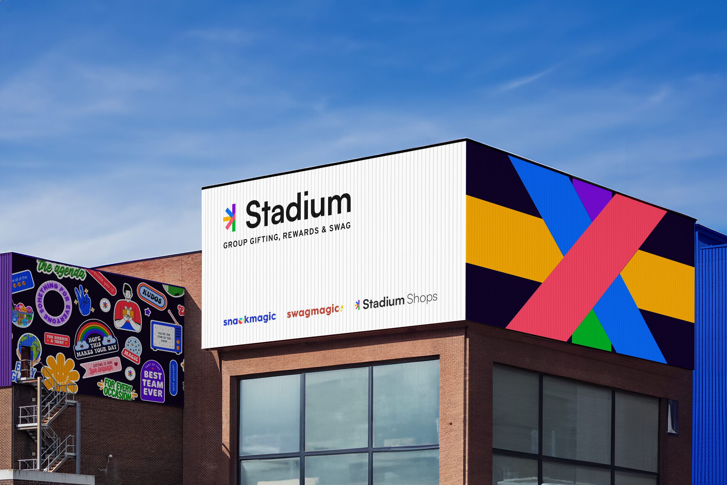
stadium branding & website designPersonalized Group Gifting Made Simple, No Matter the Scale, with Stadium
design practices
identity design, ux & ui design
software used
adobe illustrator, photoshop, figmaDuring my time at Stadium, I had the incredible opportunity to lead the design team in a transformative rebranding effort aimed at reshaping the company's identity to better reflect its mission of personalized corporate gifting. Recognizing the limitations of the previous logo, we conceptualized a half-star symbol that embodies flexibility, connection, and growth, illustrating Stadium's evolution in the gifting landscape.
This project was immensely rewarding, as we collaborated to create a cohesive branding system that seamlessly integrates across digital and physical platforms. We developed the branding to be versatile, ensuring consistency and memorability across all applications—digital, print, and in-person. This approach not only enhanced Stadium’s visual identity but also positioned the brand for a dynamic and successful future.
Client
stadium | www.byStadium.com
project contributors/advisors
luiza shinn, hannah taylor, denise paikDesign Process
The design process began with an exploration of various typography styles, ultimately choosing a typographic logo to create a standout, eye-catching design. I integrated colors representing each cider flavor and incorporated the fruit's shape and color into the packaging. The result is a visually striking and memorable design that aligns with Ellis Orchards' heritage and sustainability goals.
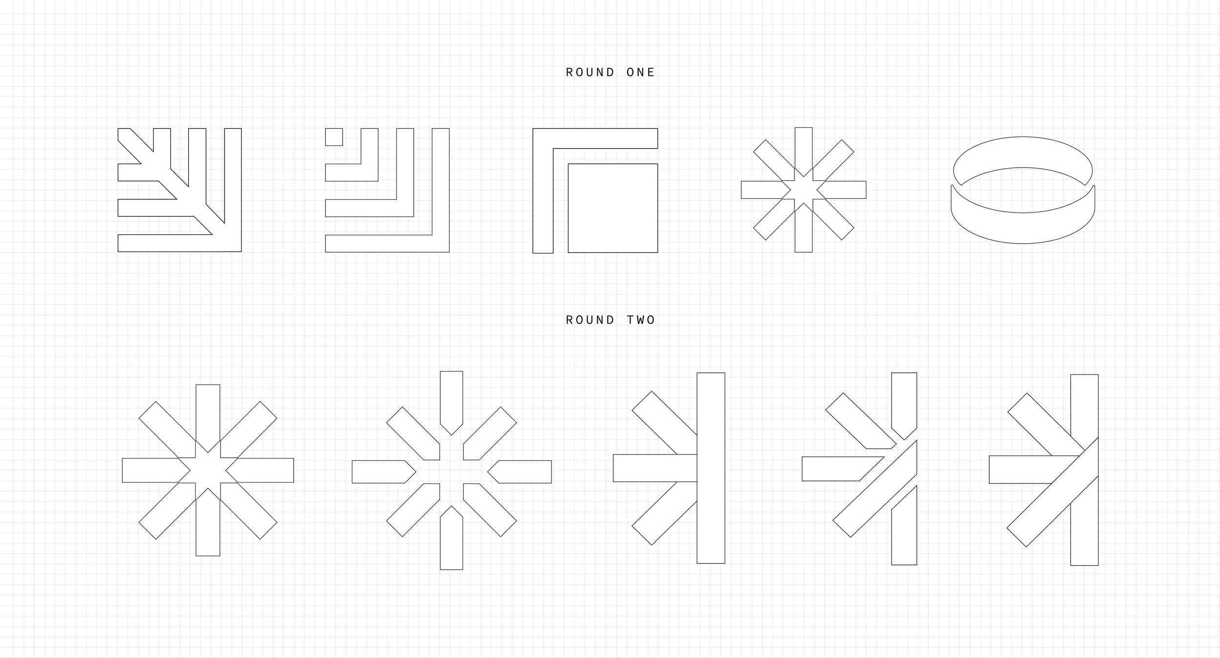

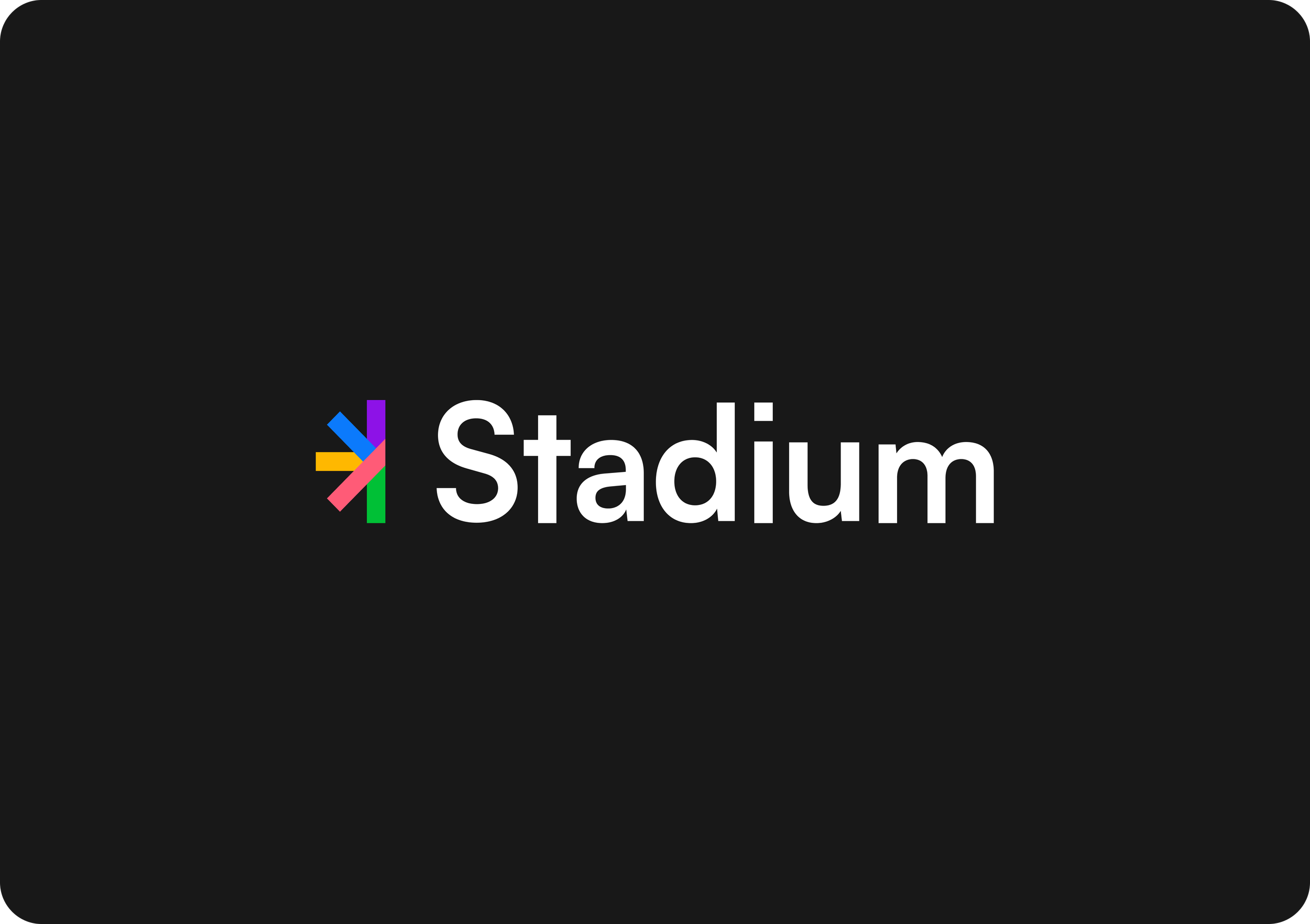
Symbol Definition
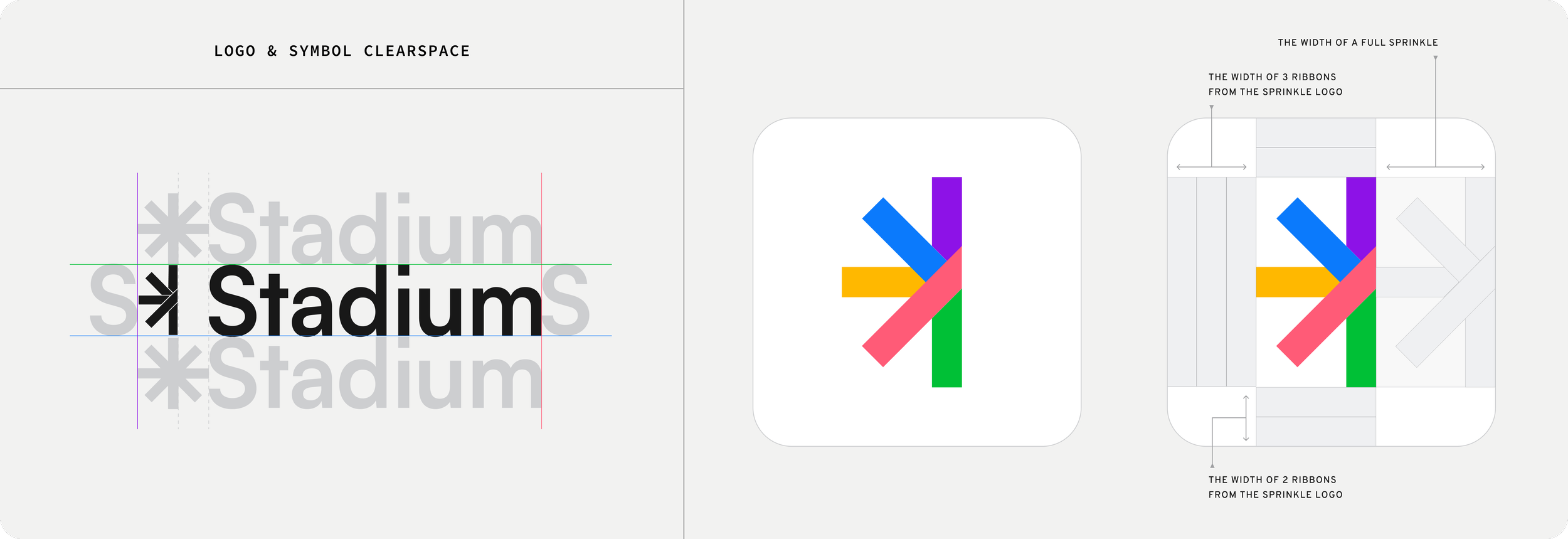
The logo design features a captivating half-star sprinkle shape that carries the mission and vision of Stadium. The sprinkle embodies Stadium as an umbrella company, with the branches of the shape representing our expansive offerings. The tone portrays connectivity, and represents the celebration of moments big and small. The sleek and dynamic nature of the half-star shape reflects Stadium's adaptability in an evolving market. Why only half a star? This symbolizes room for growth as a company and opportunities to come.

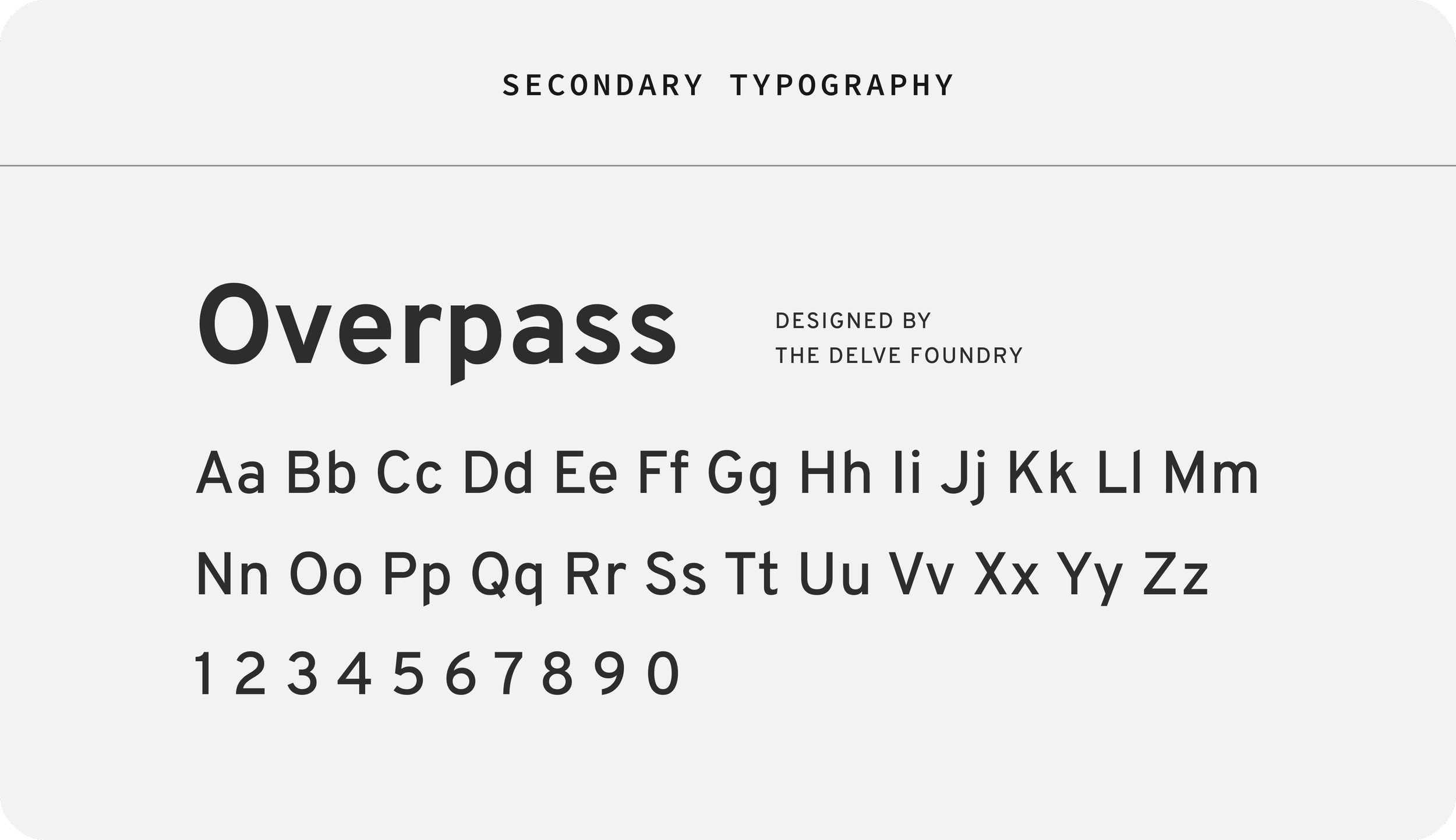
Typography
For the Stadium rebrand, we tried out different fonts to give the logo a fresher look. The old all-caps design felt too stiff, so we switched to a title-case word mark, which the team loved. Choosing the Satoshi typeface was a great move—it’s super adaptable and gave the logo a modern, approachable vibe that works well in any setting.
LOGO APPLICATION PROJECTStadium Shops Marketing Website
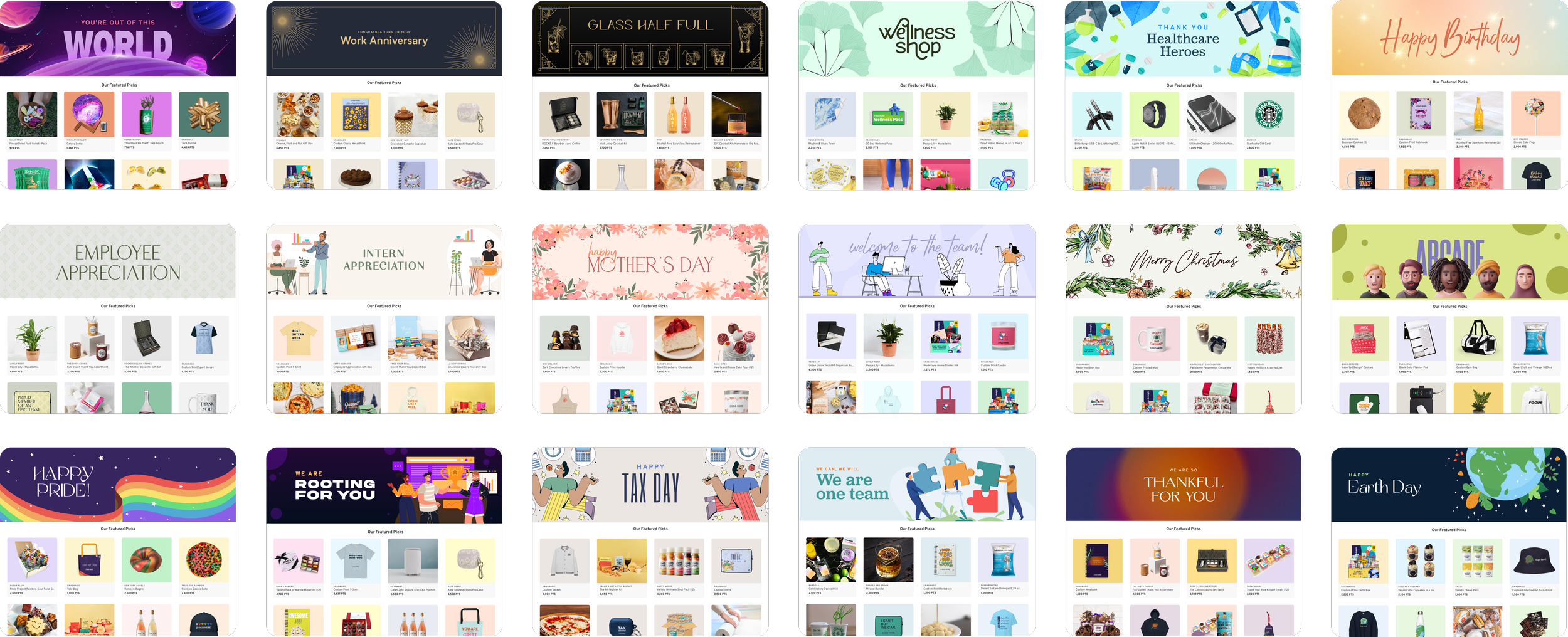
As the lead designer on the Stadium Shops project, I collaborated closely with my team to bring the platform’s vision to life. Launched in 2023, Stadium Shops lets companies create customized themed shops for occasions like employee appreciation and charity events. We aimed to capture the platform's uniqueness, using themes and a flexible brand identity.
The design process went through multiple iterations, focusing on striking the perfect balance between creativity and functionality. I aimed to make the website intuitive and visually engaging, ensuring that even new users could easily understand the concept of customizable, themed shops. The final result is a fresh, dynamic site that reflects the innovation and flexibility of Stadium Shops. This project was both creatively fulfilling and challenging, pushing me to refine the design while keeping the user experience at the forefront.
Early Iterations
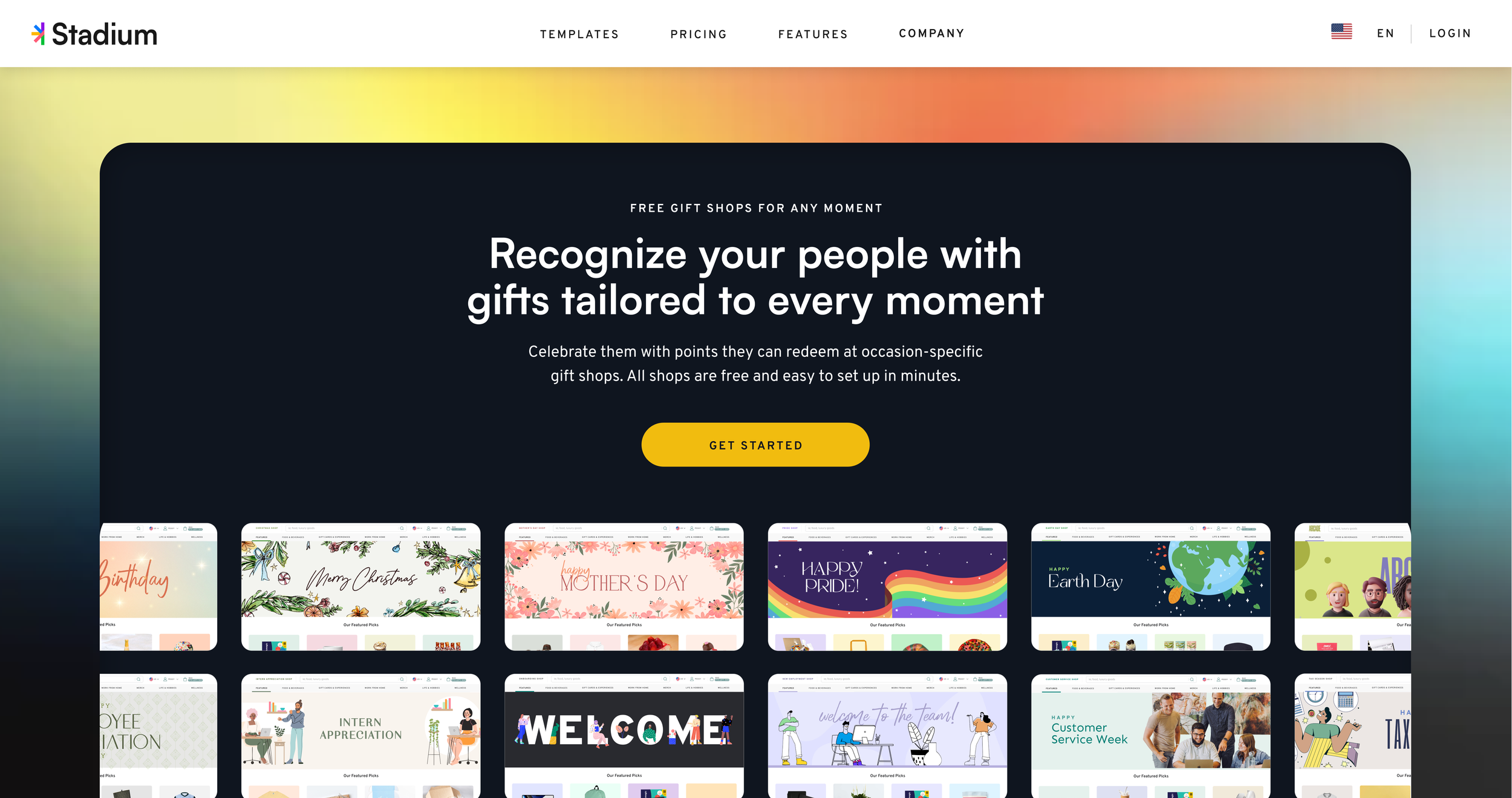
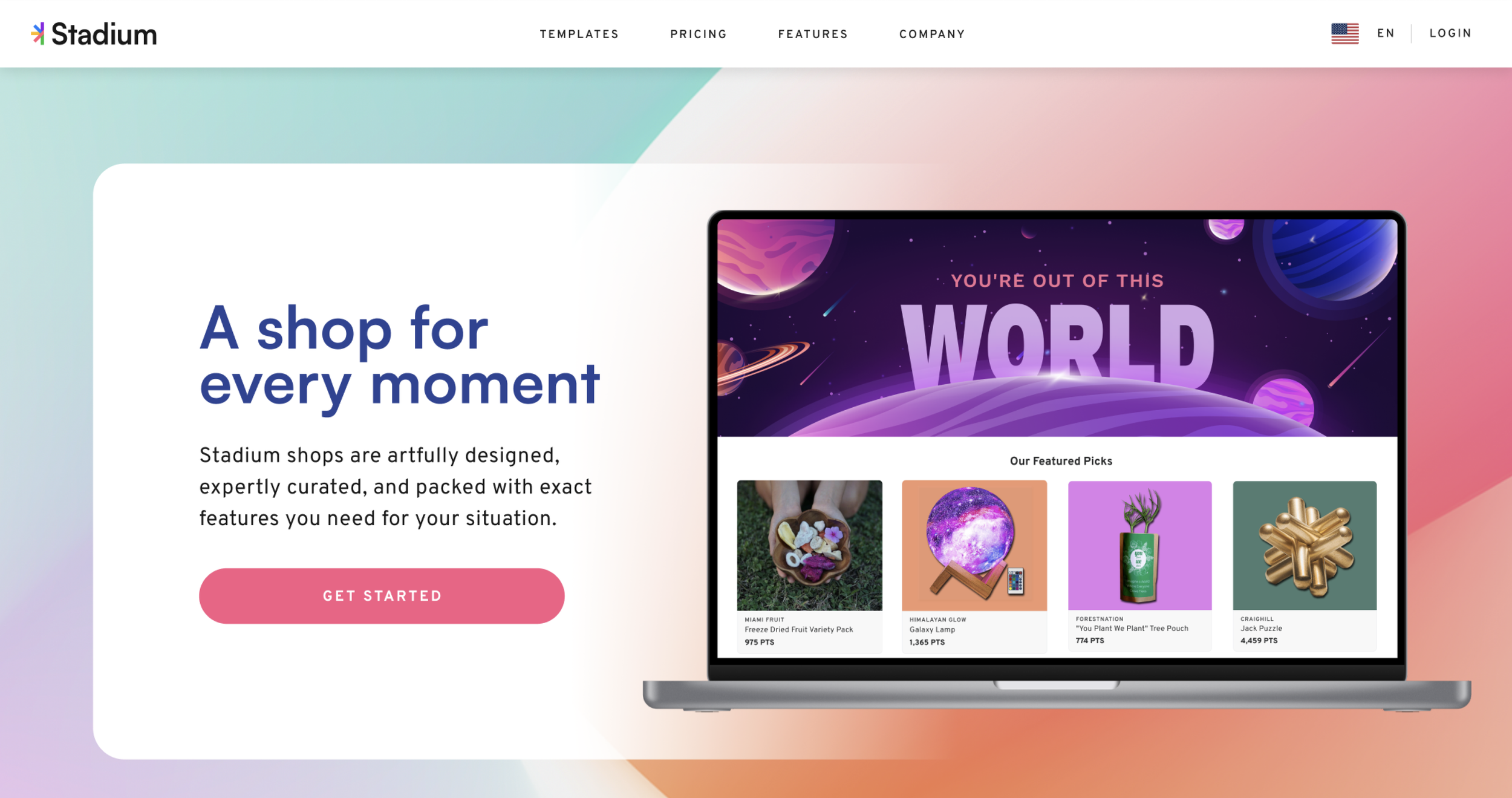
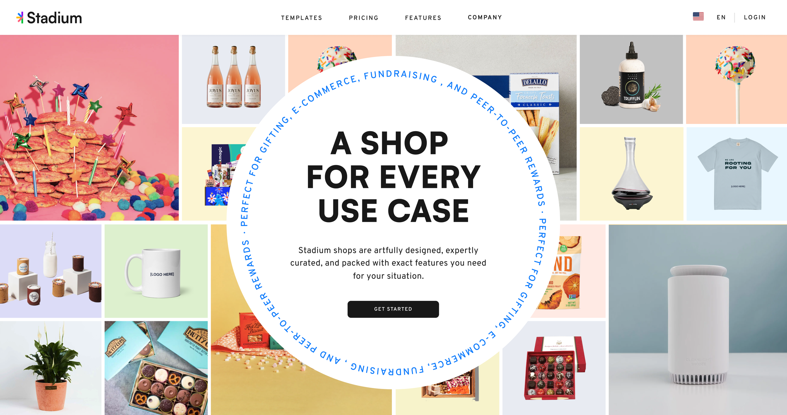
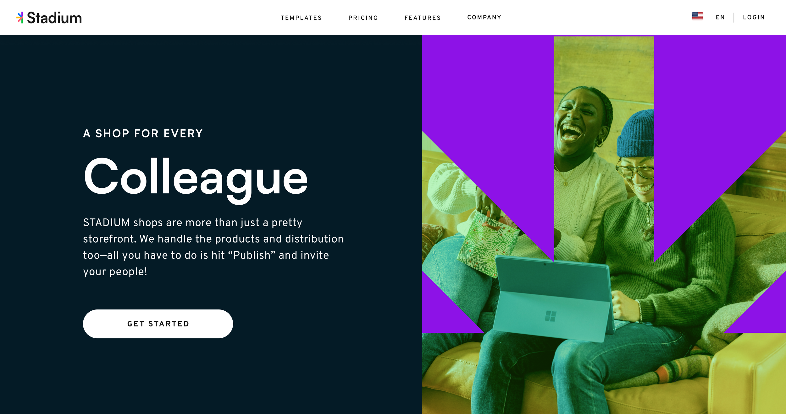
We developed four early iterations of the hero banner for the Stadium Shops marketing website, each exploring different visual approaches. The goal was to balance eye-catching design with clear messaging about the platform’s features and versatility. These early designs shown below helped shape the final, refined hero banner.
Hero Banner
For the hero banner design, I incorporated the actual themed shop designs I created for Stadium. My idea was to feature a carousel that focuses on one shop at a time. As each shop is highlighted, the entire hero banner adapts to the theme of that particular shop, transforming the visuals to match its unique design. This approach not only showcased the diversity of shop themes but also created an immersive, dynamic introduction to the concept right from the homepage.


