brand guidelines design Designing a visual branding system for Singapore Airlines
design practices
identity design
software used
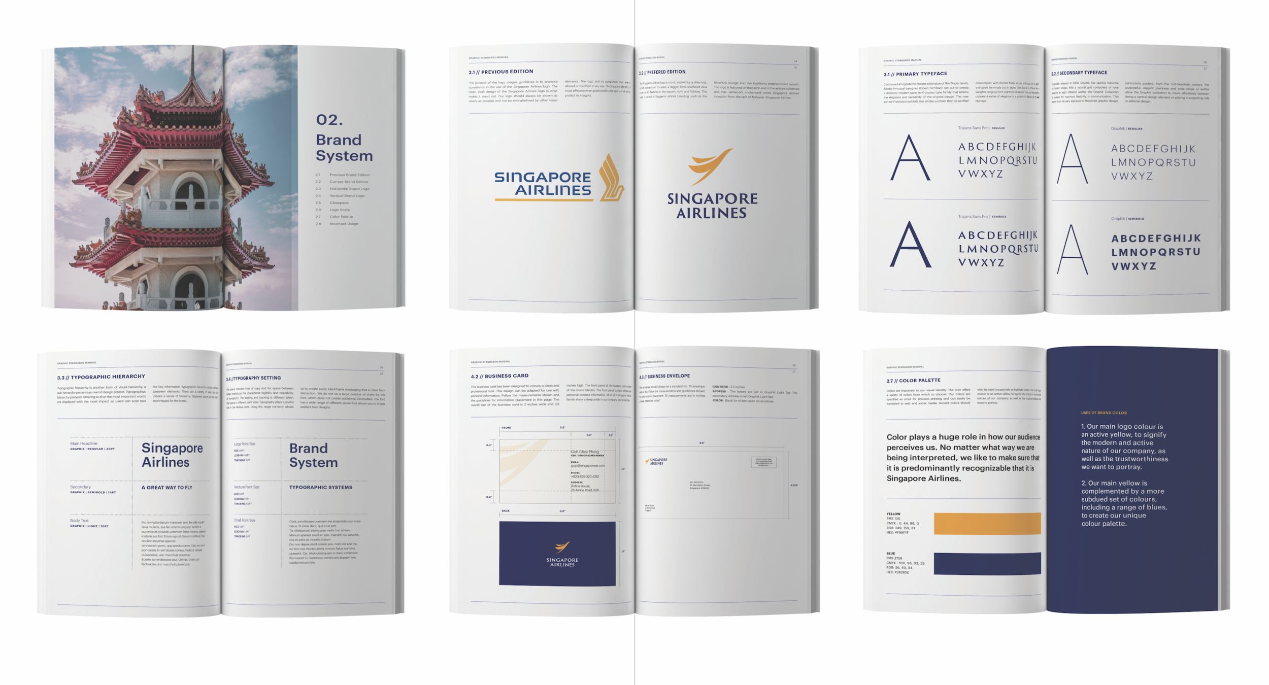
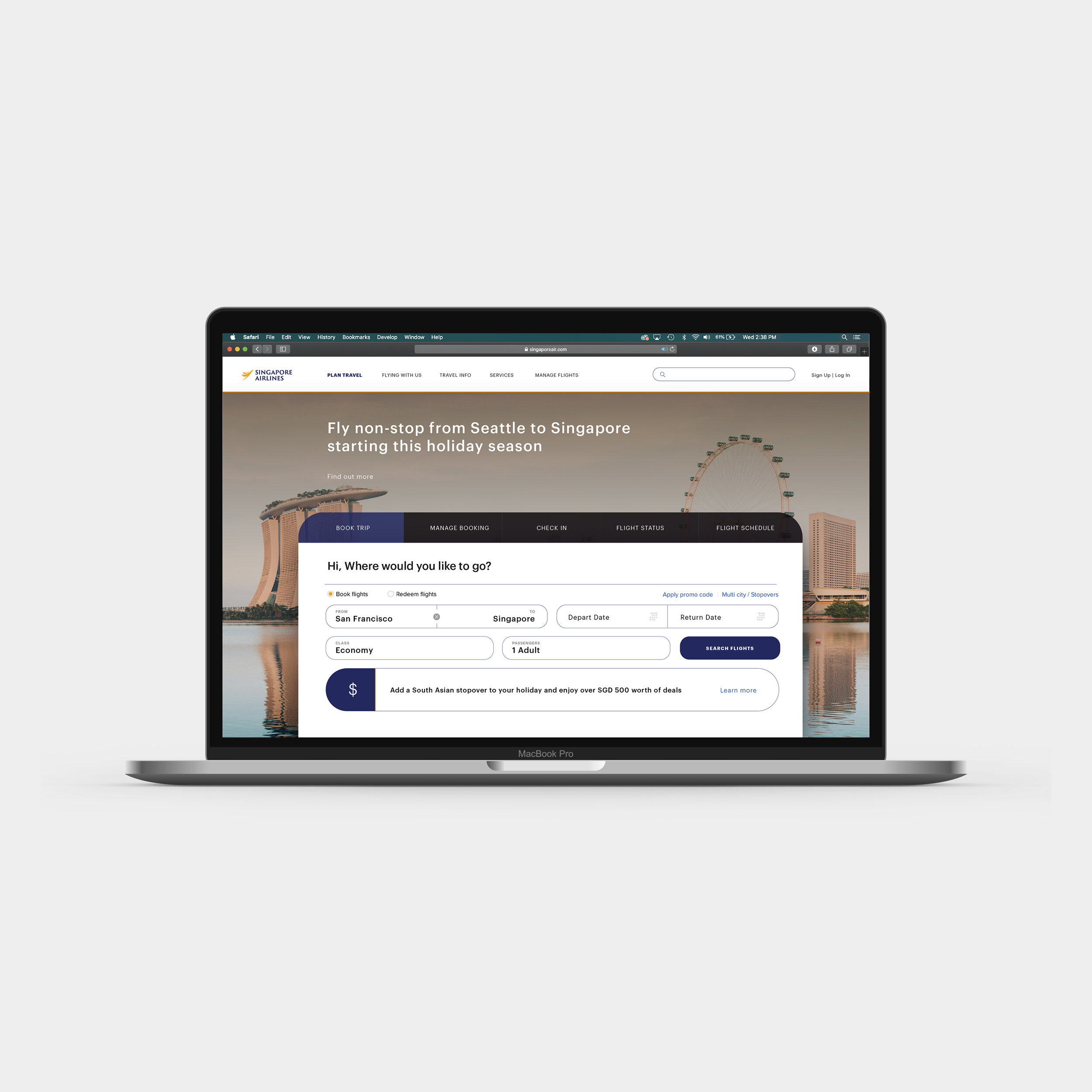
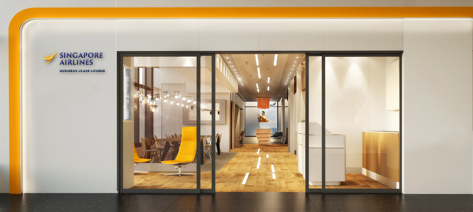
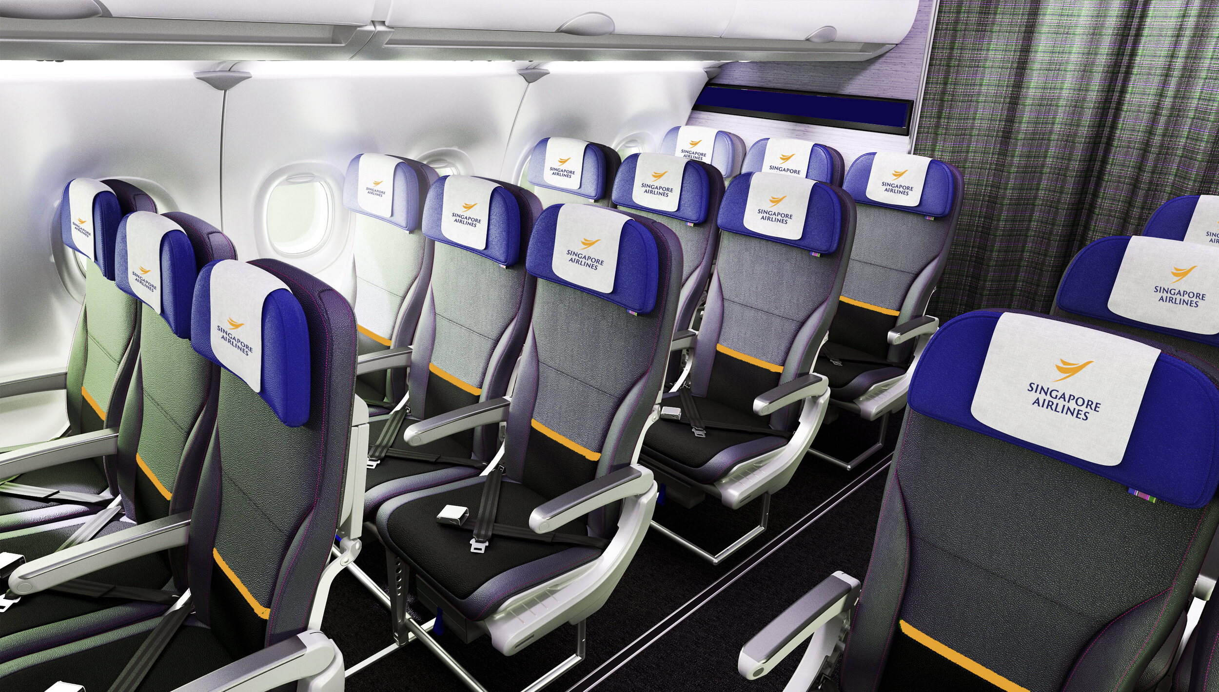
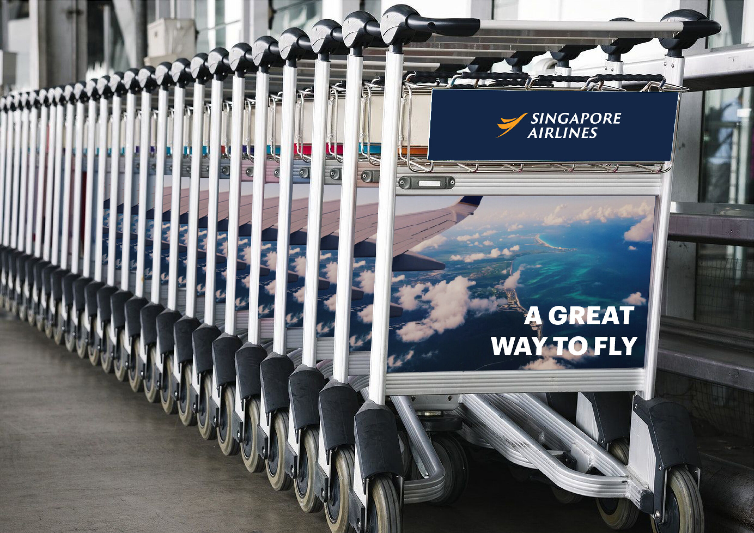
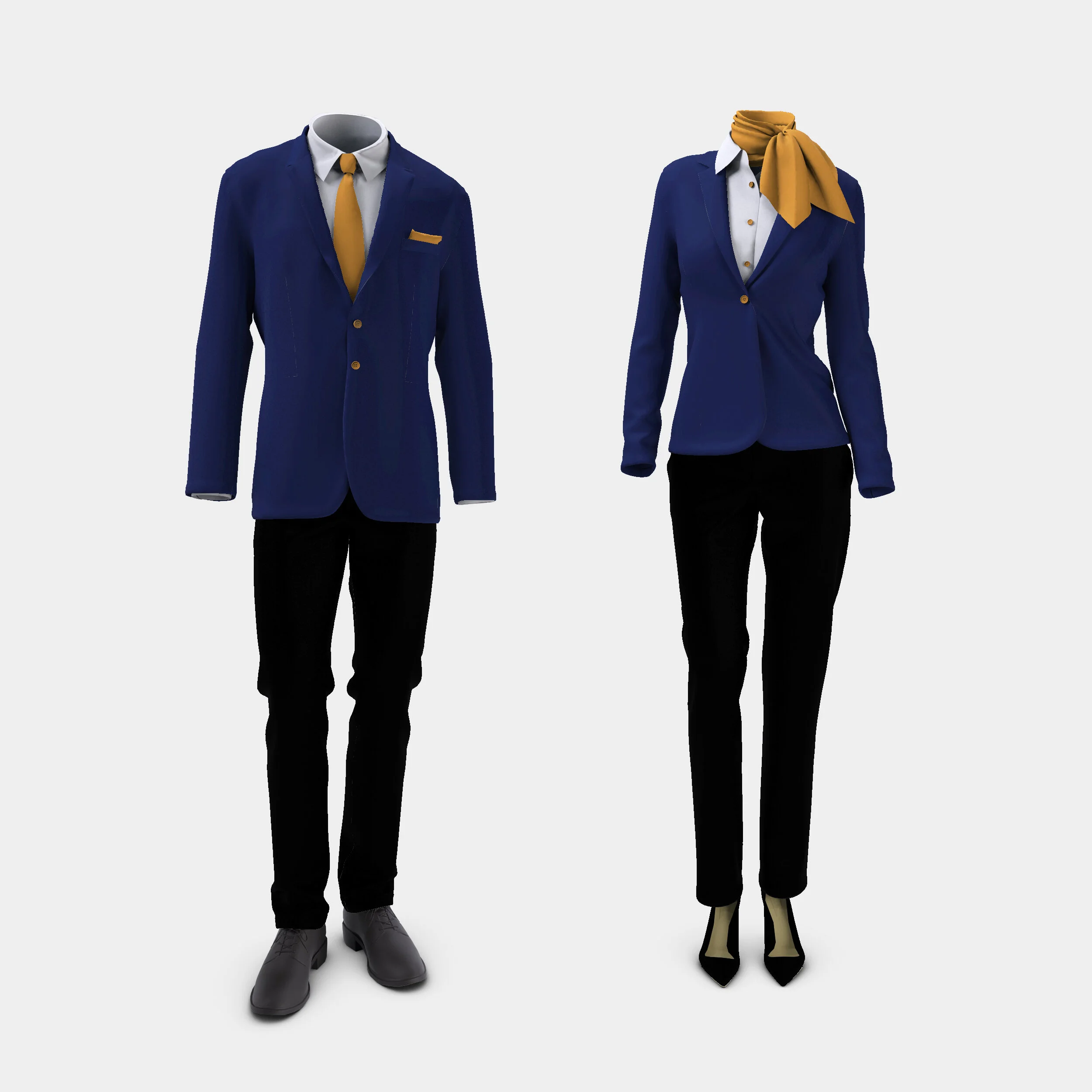
adobe illustrator, photoshop, indesignThe goal was to develop a long-term brand identity that effectively conveys the values of Singapore Airlines while establishing a unique, patriotic, and reputable image for the airline. This involved rejuvenating the existing Singapore Airlines logo and creating a Graphics Standards Manual to ensure a visually cohesive system across various applications.
The design retains the original blue and gold colors and incorporates the Silver Kris—a bird inspired by a dagger from regional folklore—featured in the main logo. This element signifies the airline's culture and heritage, while the overall design communicates safety and reliability to its loyal passengers.
CLASS
identity DESIGN 02 AT THE ACADEMY OF ART UNIVERSITY
timeline
6 weeks (september - october 2019)Design Process
For the Singapore Airlines branding project, my design process began with in-depth research to understand the airline's values, history, and market positioning. I developed concepts that modernized the existing logo while retaining its heritage elements, such as the blue and gold colors and the Silver Kris. I created a comprehensive Graphics Standards Manual to ensure visual cohesion across all applications, emphasizing safety and reliability in the design. Through stakeholder feedback and refinements, I established a unique and patriotic brand identity that resonates with loyal passengers and reflects the airline's commitment to excellence.

