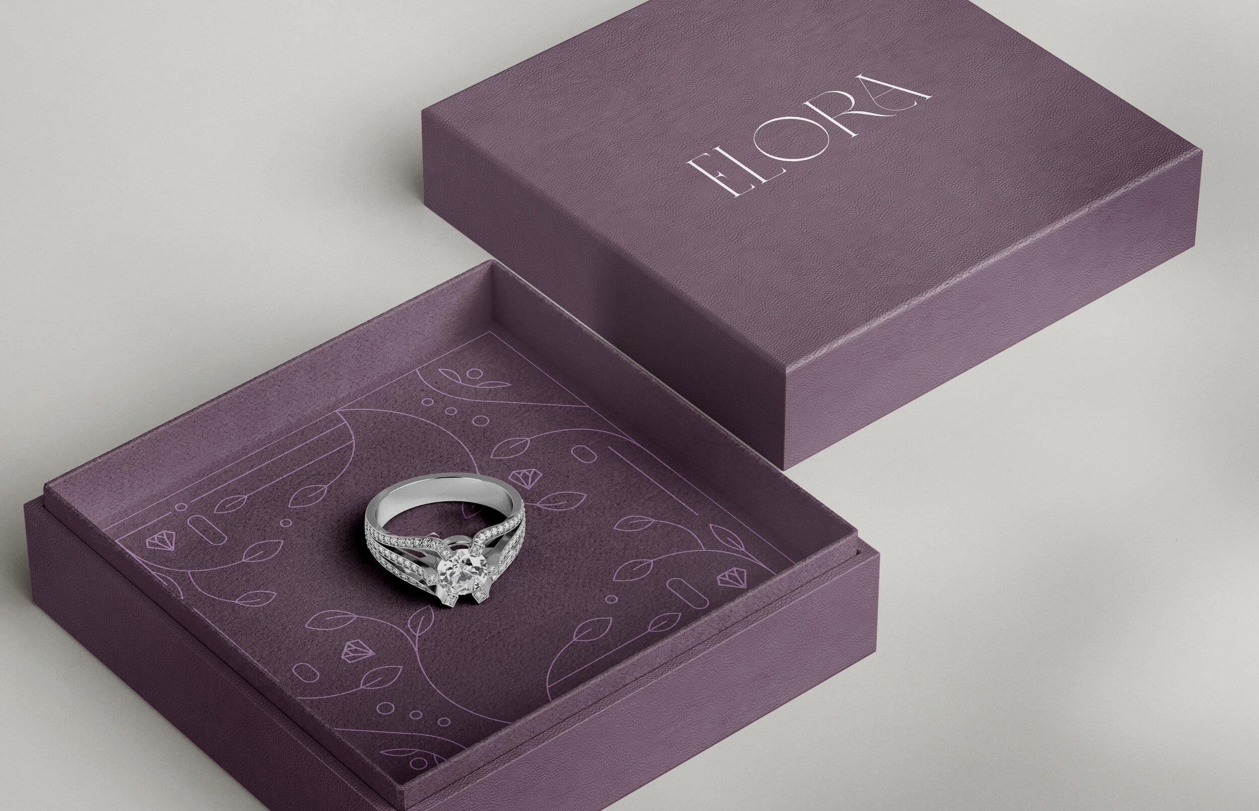
jewelry store brandingA High-End Jewelry Identity Redefined: Elora
design practices
identity design, packaging design
software used
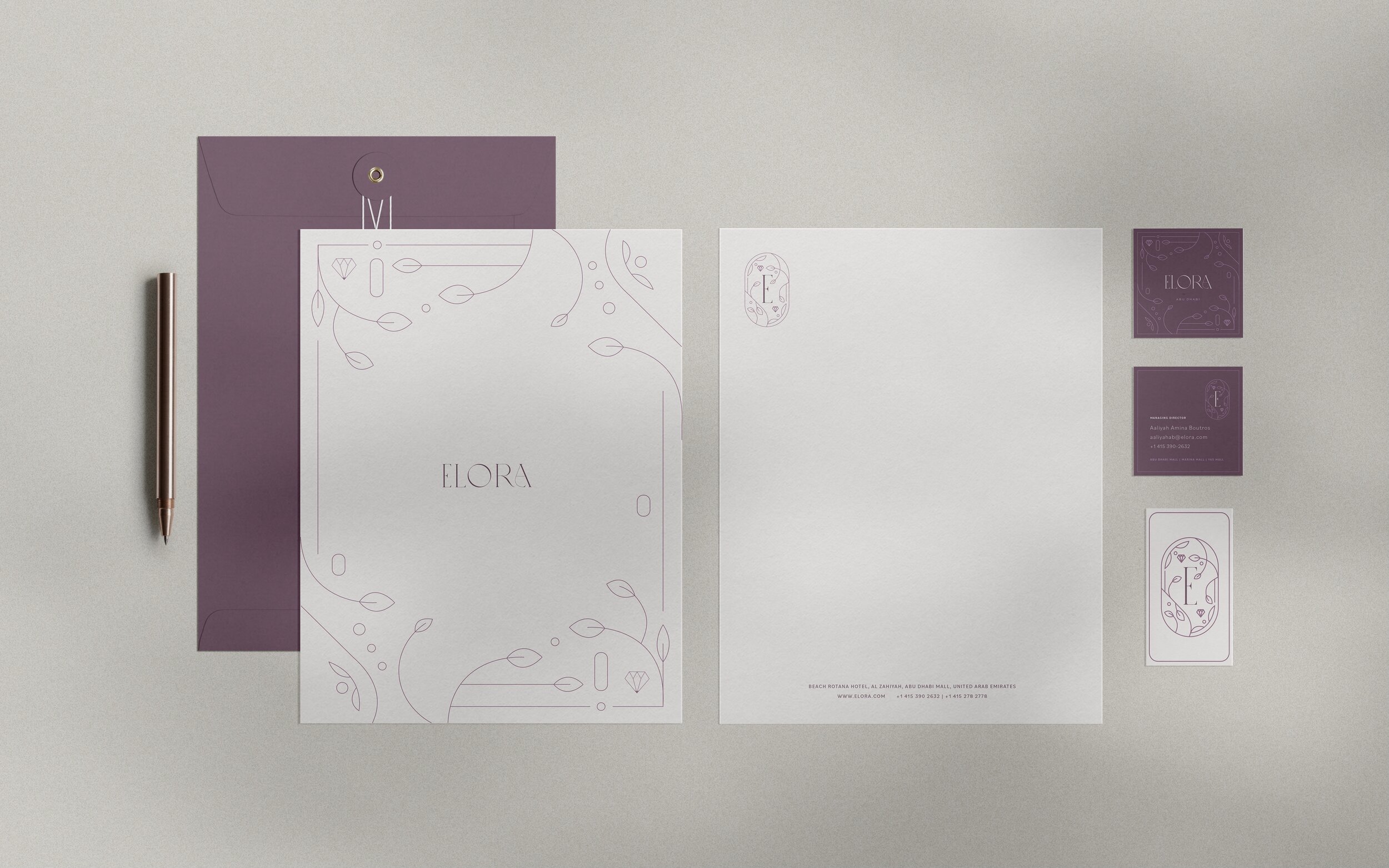
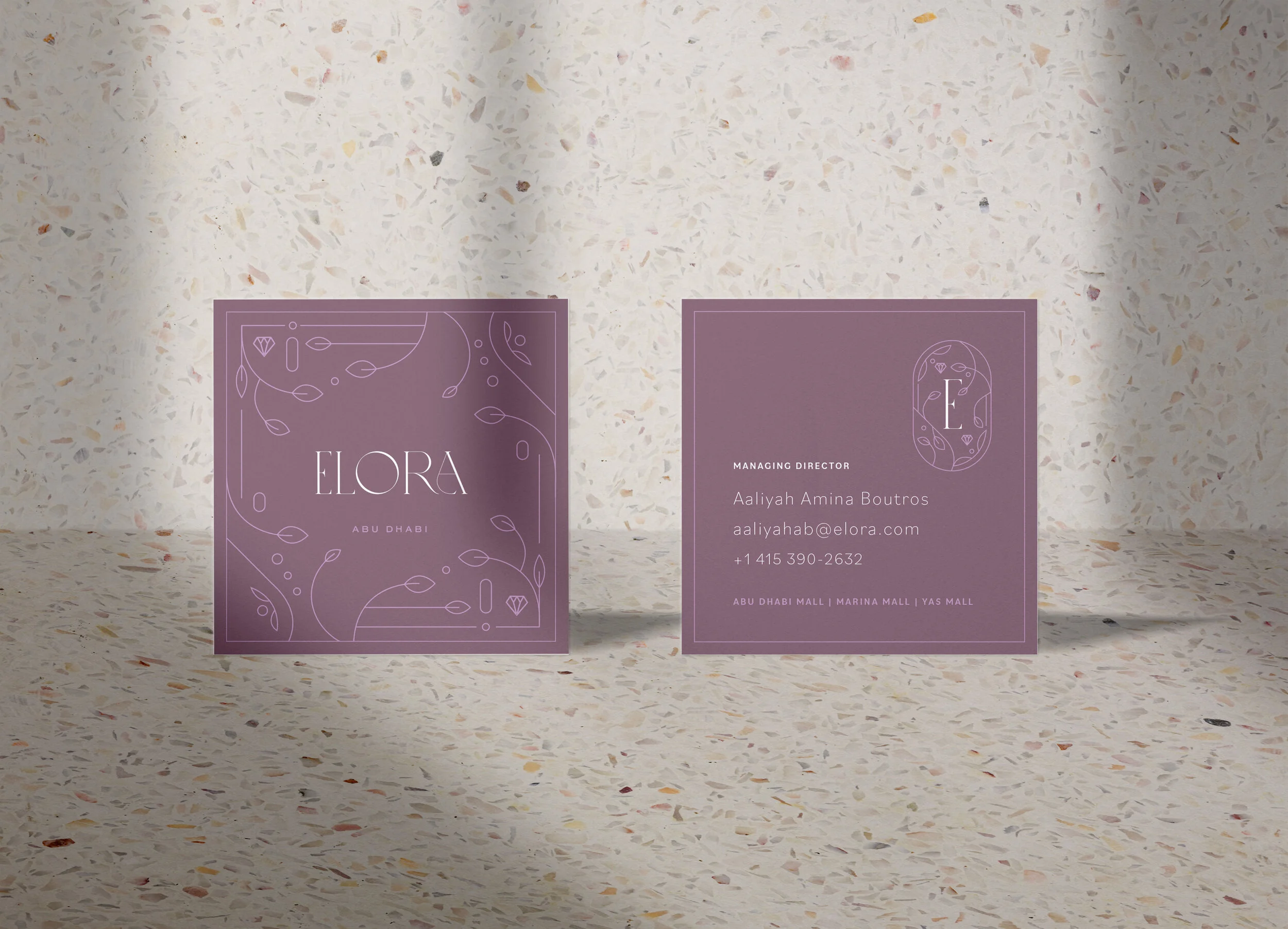
adobe illustrator, photoshop, dimensionElora Jewelry, a high-end store founded in 1989 and cherished by the Boutros family, sought a refreshed brand identity to reflect its rich heritage and modern sensibilities. The rebranding focused on the first pair of earrings ever crafted—dainty floral lavender studs—which inspired the elegant lavender color palette. This choice honors the store's origins while evoking sophistication and warmth, inviting customers into a timeless yet contemporary experience.
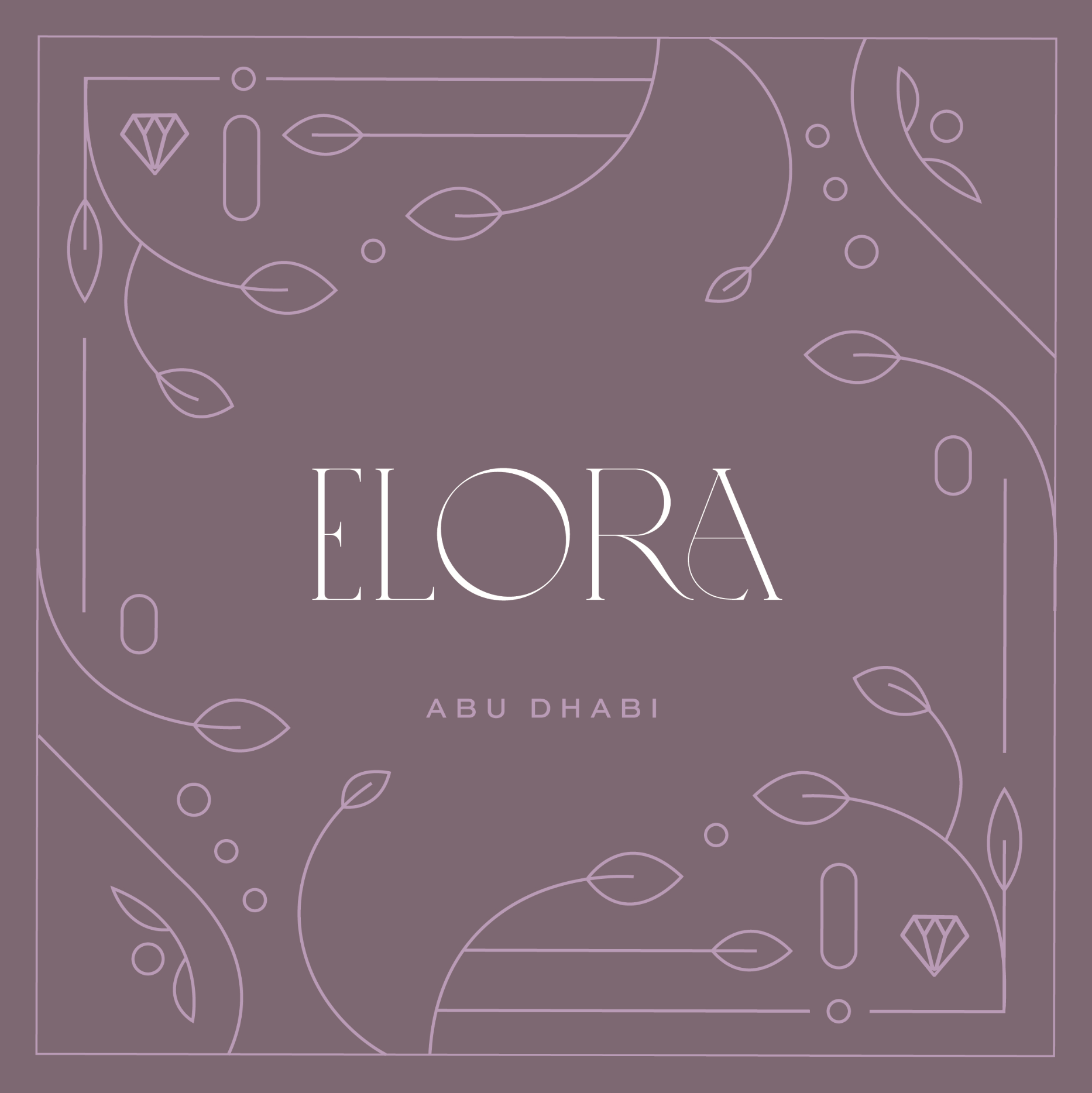
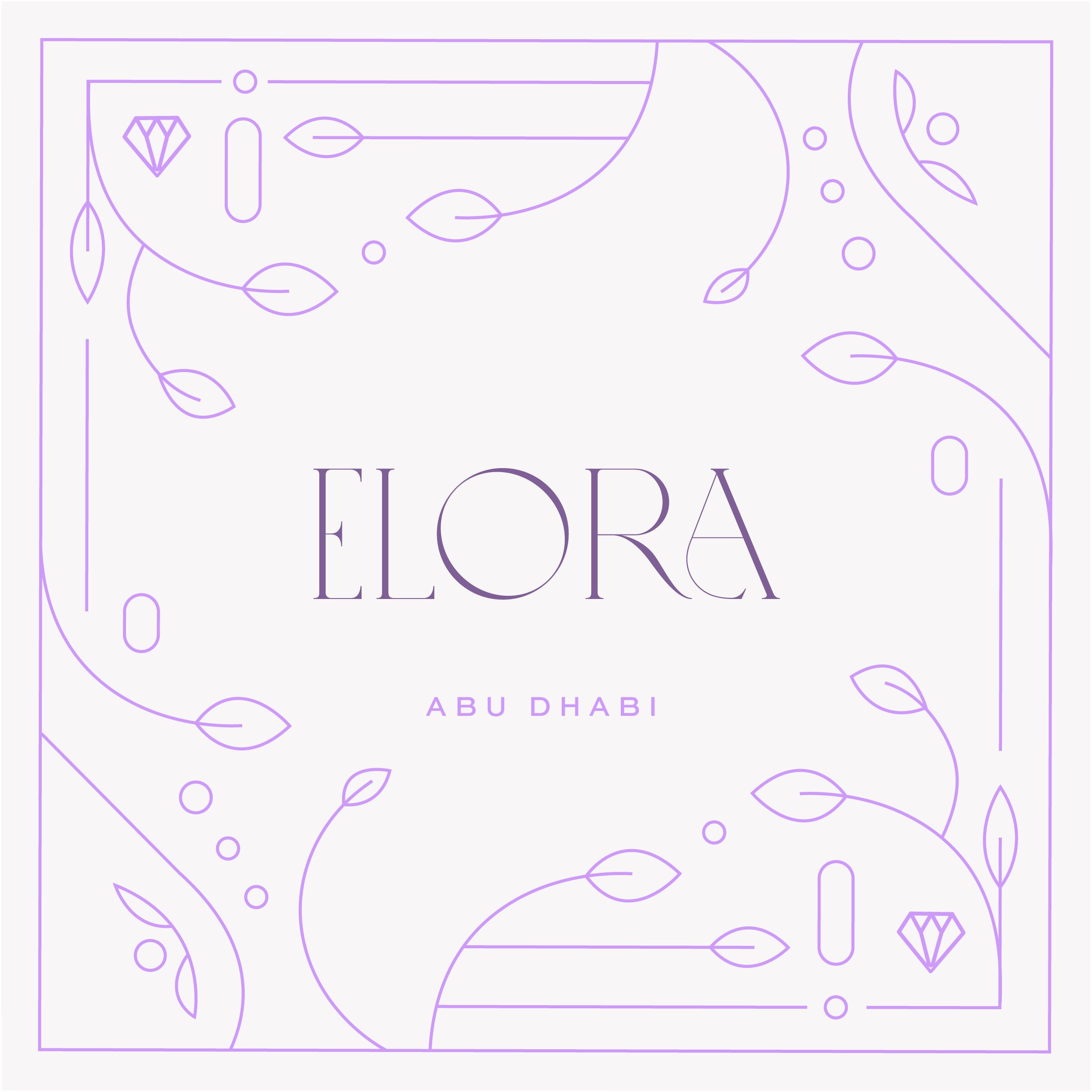
To capture Elora's essence, the typography was designed to embody elegance, luxury, and approachability, creating a harmonious balance between high-end appeal and friendliness. The visual branding features intricate floral motifs and illustrations celebrating the company’s history, fostering a connection with its roots while positioning Elora as a forward-thinking jewelry destination.
CLASS/Client
conceptual passion project
timeline
2 weeks (july 2020)Design Process
My design process for the Elora Jewelry rebrand began with a deep dive into the brand's core values and target audience. I explored various color palettes and ultimately selected lavender to evoke a sense of elegance and warmth. The typography was crafted to reflect the brand’s attributes of luxury and approachability, ensuring it resonates with a high-end clientele. Throughout the process, I integrated floral motifs and illustrations to create a cohesive visual identity that feels modern yet timeless. Sketching, prototyping, and gathering feedback were crucial steps in refining the design, ensuring it effectively captures the essence of Elora Jewelry.
